An interesting article from The Guardian about Book dedications.
Just an extract that I have taken from the article that I thought was quite relevant to the brief as it is mentioned within the brief written by ISTD.
Some novelists don't mind playing to the gallery by dedicating their latest not to an individual but to practically everyone who might pick it up, engendering an illusion that they are writing just for us. JK Rowling's dedication in Harry Potter and the Deathly Hallows does give a handful of named dedicatees but finishes with: "To you, if you have stuck with Harry until the very end." Compare that with Mark Z Danielewski's much more brutally honest message at the front of House of Leaves: "This is not for you."
Tuesday, 6 December 2011
Monday, 5 December 2011
QR gift wrap
Some interesting ways of using various QR codes and creating seasonal themed imagery using them. The QR codes reveal hundreds of different gift ideas. Designed by The Chase.
Thursday, 1 December 2011
Hewetika
A similar project to what I am doing voidwreck has created Hewetika which is a variation of Helvetica but it focuses on a few of the letters and they have been redesigned. The W, A, K and 0 have been changed to create a variation of the typeface Helvetica. Designed by Void Wreck.
Void Wreck
Karl Nawrot & Walter Warton based make up Void Wreck in Amsterdam have made some interesting typefaces.

LM Typeface (2007) / Invitation — Identity for the gallery Luettgenmeijer (Berlin, Germany) / Invitation: 210 mm X 297 mm
Wednesday, 30 November 2011
-
Some interesting formats and layouts that I could use to present the typeface(s) in the publication.
Tuesday, 29 November 2011
14 unusual punctuation marks
14 unusual punctuation marks
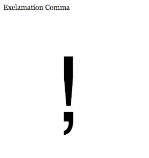
Some of the less used punctuation marks. It is interesting to see what they are used for and how they could be used within a body of writing and design work. I am not going to create these glyphs for my typeface as I would like to look further at this area for my FMP, exploring this and the structure of language, signs symbols and punctuation.
Some of the less used punctuation marks. It is interesting to see what they are used for and how they could be used within a body of writing and design work. I am not going to create these glyphs for my typeface as I would like to look further at this area for my FMP, exploring this and the structure of language, signs symbols and punctuation.
Catalan cultural activities- London
Creativity and design of communication materials and website for the Catalan cultural activities organized in London following the Joan Miro exhibition at the Tate Modern. Designed by Toormix a studio based in Barcelona who focus on corporate identity, art direction, editorial design and communication.
Tuesday, 22 November 2011
Cd packaging
Some cd packaging that I owned, Cd's come in a variety of different packages, the ones I have photographed are more common packages. I am looking for something light weight, easily reproducible but at the same time can hold and protect a cd securely.
Monday, 21 November 2011
Neon signs
Found images that I have taken inspiration for the app colour scheme.
Open publication - Free publishing - More brief 1
Sunday, 20 November 2011
Pampered chef
The change of direction has got me looking at various host your own type of parties/social gatherings one of which, being well known for it is pampered chef. The aim of this company is to book a show online and the Pampered chef sends over a consultant to help you host the event where the host and the guest participate in cooking various things. During and after the event there is opportunities to purchase order the various equipment used in the show, which is all branded by pampered chef.


Subscribe to:
Comments (Atom)


