Showing posts with label OUGD101. Show all posts

Sunday, 22 November 2009

Producing images that effectively communicate a message to an audience

Plane Stupid: Polar Bear


This advert is intended to shock the audience with very strong visuals of polar bears falling from the sky like rain, it is confronting the audience with the effects of short hall flights. The comparison between the weight of the polar bear and the amount of carbon emissions a short hall flight uses doesn't become clear until the end of the clip. The sound in the video is also relating to flying as its the sounds like an aeroplane when the polar bears are dropping out of the sky. It is understood that global warming has a direct affect on animals such as polar bears and it can be easily understood what they message is behind the video clip.

McDonald's Wi-fries:

This poster is part of how McDonald's advertised the free Wifi they offer in restaurants. The main focal point of the poster are the fries are arranged into a symbol that is often associated with wireless networks and Internet. Also in the poster the audience can associate the fries of McDonald's shaped in a Wifi symbol to mean that while they are eating they can use the Internet.

Sabina Stobrawe: Divorce Lift

I thought this piece of design was very cleverly crafted, as it is shows how affective a simple wedding photo and a set of lift doors can be to advertise your business. It is easy for people to see when the doors open and the couple split in half that this symbolises them splitting up. Then once in the lift the attention is averted to the sign for the law firm.

Green Peace- GM crops:

In this advert to raise awareness for GM crops they have decided to use images of vegetables (crops) shaped as insects. The message that they are trying to portray is that many things like insects, animals and viruses can be contained in genetically modified food. The images work well on there own but the text that is used to support the images is needed in order to portray the underlying message of the posters.

Agency: BBDO Moscow Brand: Greenpeace

Swiss- Swiss International Airlines:


Interpreting image of the present, past and a range of cultures

Bauhaus Obama


Calligraphy:
Jordan Jelev


Swiss:


Tuesday, 17 November 2009

The ability to construct meaning from visual images and type

Road Signs

All over the world road signs are used to warn, inform and direct motor vehicles, pedestrians and cyclists. Road signs are widely understood by the generally public as they are simple and easy to read using a small selection of shapes that represent what information the sign is giving. Signs are regarded as visual metonym as the shapes symbolise a literal meaning e.g anything within a triangle is regarded as a warning. The signs in the picture are selected from various countries round Europe. The only differences to each other are the graphics vary slightly, slightly different colour schemes and the local language varies.
Airport Signs

Similar to the road signs these airport signs are universal all over the world, they communicate where different places are with simple symbols that are easily recognised by the majority of people. The colours of the signs are contrasting so that the images and symbols are recognisable from a distance and they are easily readable.


Logos and Branding

We live in a world full of company identities and branding, many companies just use simple symbols as there logo. Logos such as the gold M for McDonald's and the apple for Apple Macintosh are prime examples, they are so simple but instantly recognisable. Brands like this can have a direct impact on peoples lifestyles for instance people often buy Nike and Adidas clothing purely for brand and not the product itself.


Instructions:

Instructions can be found for most things nowadays, I came across these instructions for looking after your baby. The instructions include simple imagery showing what to do and what not to do, because the message is being portrayed through the set of visuals there is only need for text as the titles of the diagrams.


The Dark-side of switzerland:


Wednesday, 28 October 2009

Autobahn

I came across this project by Autobahn, they have taken the font helvetica and used it as there base and constructed three different fonts, Heldentica Tomatica and Gelvetica.

Production method: Toothpaste/Ketchup/Hairgel


I think it is clever they way they have used the different materials to create the fonts. All three of these substances are not very easily controlled and harder to manipulate than things like wood and metal.


Tuesday, 27 October 2009

Kavinsky- Testarossa Autodrive

I quite liked the song when I was playing a computer game that it was on so I decided to look it up and this was the music video for it. I thought the illustrative concept of the video is something that really stands out for me and the way that most of the colours are dull except for red and white.

Stefano Buffoni

While browsing through different design forums I came across Stefano's piece of work called Shock Typography. This reminded me of the alphabet soup Illustrator brief, where I have to produce 26 different manipulations of one single letter from my "Compress" project. All three of the Shock designs show the use of negative space and a limited colour palette similar to what I am using.


These two pieces of typography are also in his portfolio:

Milky typography
BLVD typeface


Helvetica

Because Helvetica is so widely used I decided to create one post with various designers in, all of which are pieces that I find interesting. Most if not all these designs are minimalistic, which in a way summarises Helvetica as it is a clean, clear and professional typeface which a lot of typefaces are based upon. Although these designs might not be the most recognised, I wanted to show a range of designs that have been produced in different ways using the font.

Sub88: T-shirt designs


Greig Anderson: Helvetica calendar 2008


Helvetica Wood type: Idea and photography by Kim Holtermand, Woodcarving by Ole Meyersahm


Monday, 26 October 2009

Album artwork

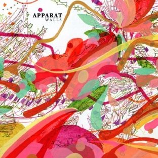
These are a variety of albums art work which while flicking through my itunes stood out at me the most. I particularly like looking at album art work, I prefer the vibrant colours and the strong use of image and type on the covers.

Modeselektor- Dark side of the sun
Apparat- Walls
Yeah yeah yeahs- Fever to tell
Incubus- Light Grenades


Gorillaz- Jamie Hewlett


Niark1


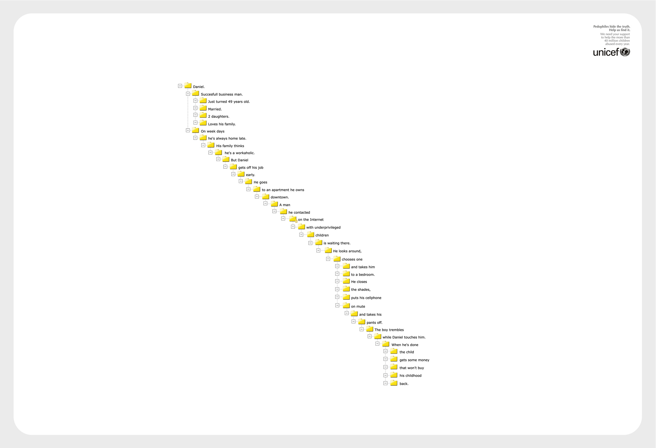
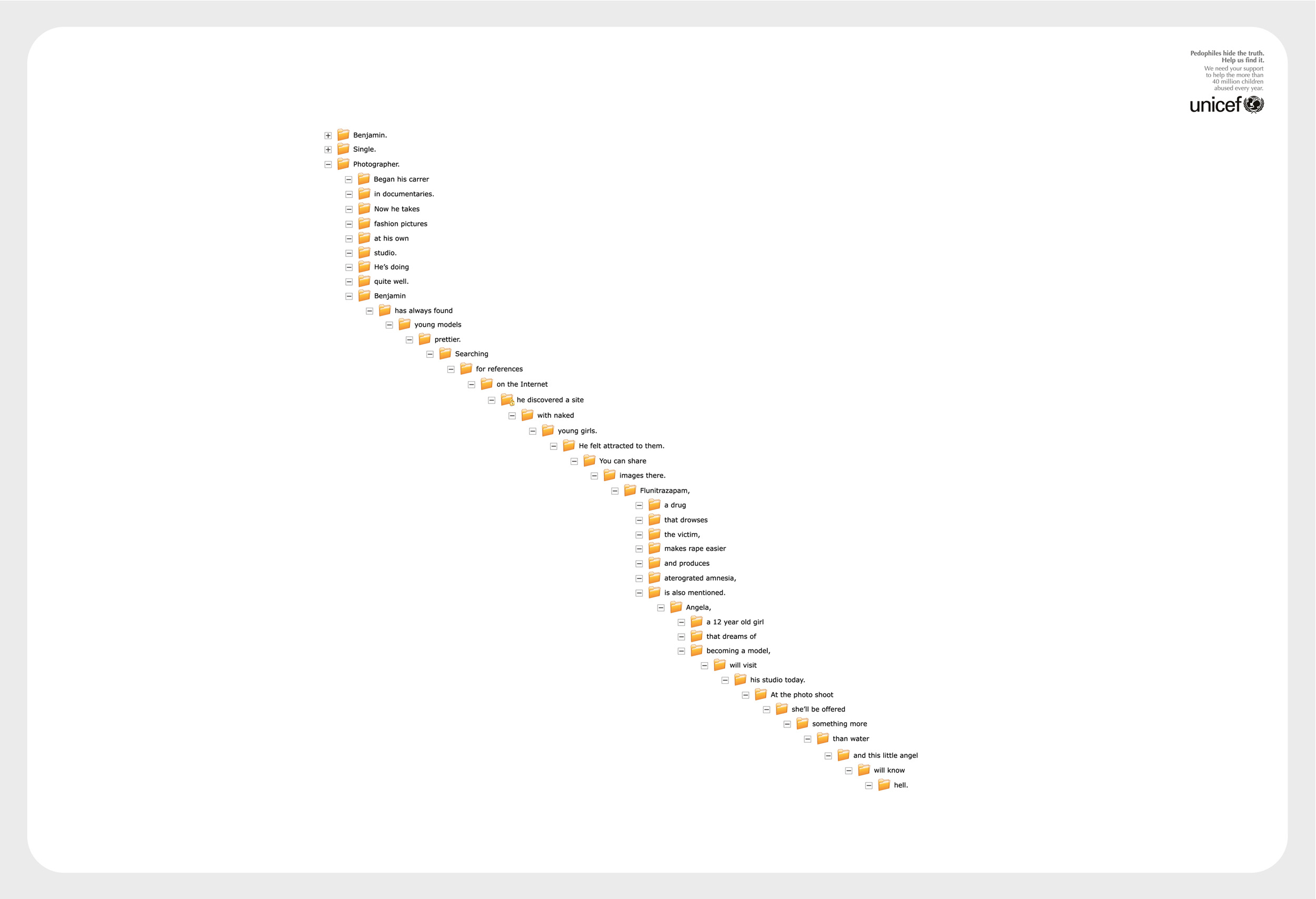
Unicef


http://www.ibelieveinadv.com/commons/unicef_yellow.jpg

Coca Cola


Thursday, 22 October 2009

Sony Bravia

This has to be one of my favourite adverts, I just think it is a great use of stop motion animation. It took 3 weeks, 40 animators and 3.5 tons of clay to make it.

Typography Periodic Table

This is a collection of the top 100 most popular, influential and notorious typefaces today was design by Cam. The table of typefaces groups by families and classes of typefaces. The ranks of the fonts were determined by these following sites:

The 100 Best Fonts Of All Time -

http://www.100besteschriften.de/

Paul Shaw’s Top 100 Types survey -
www.tdc.org/reviews/typelist.html

21 Most Used Fonts By Professional Designers -
www.instantshift.com/2008/10/05/21-most-used-fonts-by-professional-designers/

Top 7 Fonts Used By Professionals In Graphic Design -
justcreativedesign.com/2008/09/23/top-7-fonts-used-by-professionals-in-graphic-design-2/

30 Fonts That ALL Designers Must Know & Should Own -
justcreativedesign.com/2008/03/02/30-best-font-downloads-for-designers/

Typefaces no one gets fired for using -
www.cameronmoll.com/archives/001168.html


Decathlon: Better gear

This is an advert for Decathlon, produced by the French advertising agency Young & Rubicam. I think this is a great quirky way to advertise there products as it isn't something you see everyday.