

Showing posts with label Brief 2. Show all posts
Showing posts with label Brief 2. Show all posts
Thursday, 1 December 2011
Hewetika
A similar project to what I am doing voidwreck has created Hewetika which is a variation of Helvetica but it focuses on a few of the letters and they have been redesigned. The W, A, K and 0 have been changed to create a variation of the typeface Helvetica. Designed by Void Wreck.
Void Wreck
Karl Nawrot & Walter Warton based make up Void Wreck in Amsterdam have made some interesting typefaces.


Wednesday, 30 November 2011
-
Some interesting formats and layouts that I could use to present the typeface(s) in the publication.


Tuesday, 29 November 2011
14 unusual punctuation marks
14 unusual punctuation marks
Some of the less used punctuation marks. It is interesting to see what they are used for and how they could be used within a body of writing and design work. I am not going to create these glyphs for my typeface as I would like to look further at this area for my FMP, exploring this and the structure of language, signs symbols and punctuation.


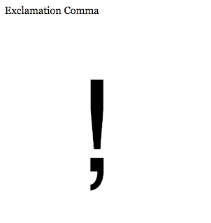


Some of the less used punctuation marks. It is interesting to see what they are used for and how they could be used within a body of writing and design work. I am not going to create these glyphs for my typeface as I would like to look further at this area for my FMP, exploring this and the structure of language, signs symbols and punctuation.


Wednesday, 9 November 2011
Sundries Aimonti zine
Sundries 210 × 297 mm 20 pages 50 numbered copies Risograph First Edition 2011. This is a nice little magazine using various duotone images in red and green.


Thursday, 13 October 2011
Adidas Laces 2011
Primarily the type will be designed for bike frames but I have liked the idea of having the potential to make the type into a 3d format, this could be for an exhibition, even or signage. Signage system and interior design adidas Laces 2011
from büro uebele visuelle kommunikation.


Found type
What I want to steer clear of is this kind of thing, found type and making letter forms out of objects.


Wednesday, 12 October 2011
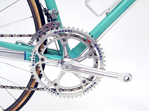
Bianchi bike parts
Slight deviation to the subject matter of the brief I was thinking of looking at bicycles and the various components of a bike and use this as a starting point to create a typeface. I was thinking of the practical/ context in which the typeface could be applied and thought that it could possibly used as the type that is printed on a range of bike frames which could be a display text in publications, potential for bike shop signage, the scope is vast.


Subscribe to:
Posts (Atom)