An interesting article from The Guardian about Book dedications.
Just an extract that I have taken from the article that I thought was quite relevant to the brief as it is mentioned within the brief written by ISTD.
Some novelists don't mind playing to the gallery by dedicating their latest not to an individual but to practically everyone who might pick it up, engendering an illusion that they are writing just for us. JK Rowling's dedication in Harry Potter and the Deathly Hallows does give a handful of named dedicatees but finishes with: "To you, if you have stuck with Harry until the very end." Compare that with Mark Z Danielewski's much more brutally honest message at the front of House of Leaves: "This is not for you."
Showing posts with label Brief 4. Show all posts
Showing posts with label Brief 4. Show all posts
Tuesday, 6 December 2011
Saturday, 12 November 2011
Macro Micro Typography
Just a quick flick through Typography: Macro and Microaesthetics: Fundamentals of Typographic Design to get a bit of inspiration. Some interesting pages on contrast in type and layout exercises, these are things to consider and experiment with for briefs 3 and 4.
Wednesday, 9 November 2011
Sundries Aimonti zine
Sundries 210 × 297 mm 20 pages 50 numbered copies Risograph First Edition 2011. This is a nice little magazine using various duotone images in red and green.

Thursday, 3 November 2011
Tuesday, 18 October 2011
Studio Aparte
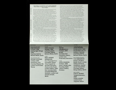
Interesting layout and typography on printed formats (catalogue and invitation) for the event about boarders within the city in Bergamo from Barcelona based Studio Aparte.

Subscribe to:
Posts (Atom)


