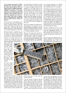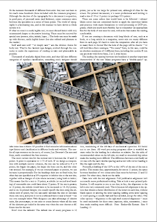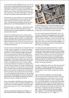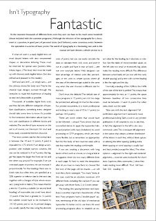


The emphasis in this session was to bring both type and image together effectively using what skills we have learned over the various different type workshops. It was important that the type remained readable, but didn't look like it had been forced into a confined space. The best method was to resize the type onto the page to see how much space was available for the image.


No comments:
Post a Comment