An interesting and informative session from James in the digital print room. It made me realise how much depth there is to how colour printing and colour theory works. James also informed us that by the 3rd year we should be able to use the printers in digital print autonomously.
Showing posts with label OUGD201. Show all posts
Thursday, 4 November 2010
Wednesday, 3 November 2010
Vino Voyage
An image I saw and scanned in from the book 1000 Restaurant, Bar, and Cafe Graphics: Signage to Logos and Everything In-between. This menu includes various different categories of drinks for the Bar Vino Voyage, each section is colour coded. This is something that I could look at when designing my catalogue for the multiple sections that I am going to include. Each different section includes a single colour with the text cut out from that colour and on the other page a simple image and the Bars logo. The stock looks to be a quite weighty with either a gloss or satin finish, with the booklet being bound with
Tuesday, 26 October 2010
Festival Survival Kit

It was suggested during the concept crit that I had a look at festival kits as it could help give me some ideas to progress. I think that the idea behind the kits is what I am looking for but I would want to present how I promoted and distributed the various packs. They would need to fit with my guide and catalogue as a brand/identity of some sort.Cycling Around the World
As I plan to create a useful guide to cycling around the various continents I am taking a look at various articles, information and other peoples past experiences when cycling around the world. Hopefully this will give me a clearer insight into what to include in the content of my guide and the various products that I could offer in the catalogue.
The continents I plan to look at:
Europe
Asia
Africa
North America
South America
Oceania/Australasia
Oil and Water Don't mix

Anthony Burill of Happiness Brussels has designed this limited edition poster (200 Prints), using the oil harvested from the beaches of Grand Isle, Louisiana. This poster was screen printed with all profits going to restoring the Coastline of Louisiana.
Thursday, 21 October 2010
Indesign Type Workshop


The emphasis in this session was to bring both type and image together effectively using what skills we have learned over the various different type workshops. It was important that the type remained readable, but didn't look like it had been forced into a confined space. The best method was to resize the type onto the page to see how much space was available for the image.
Wednesday, 20 October 2010
InDesign Print Preparation
The task was to find 8 mistakes within an Indesign document that is ready for print.

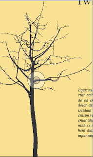
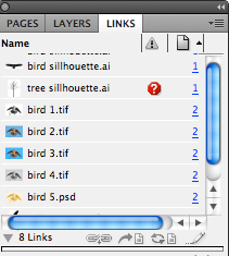
On the first page of booklet there isn't a bleed so if it were to go to print the ink wouldn't print all the way up to the edge of the pages. Also on this page the link is missing and can be checked within the links menu, if the booklet was to go to print only the outline preview would be printed.


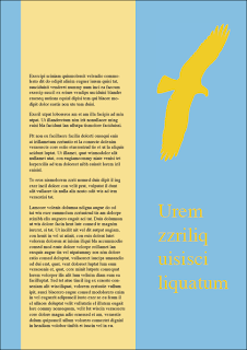
The blue on this page is an RGB colour.

On the back cover the type is over the ink limit due to it being registered.


There are two extra spot colours in the colours palette that are not used, which can result in unnecessary plats being made by the printer, that cam increase the cost of printing. These need to be deleted before sending to the printers.Tuesday, 19 October 2010
Thursday, 14 October 2010
Indesign Type Session
Document set up in Indesign.

This exercise was to focus on the hierarchy on the page, learning how the eye works when looking at a page. My aim was to draw the audiences attention to the bottom left corner of the page, working there way to the right hand side hopefully diverting the attention to the word desperate before finishing on the left hand side of the page.
This exercise moved from using a simple sentence to a couple of paragraphs of text, the aim was to get your text to fit the column with your chosen type.

In each column thereafter the point size had to decrease by one but the text still had to fit the whole length of the column, this was achieved by increasing the tracking on the body of text. Once this was complete each row chose one persons 4 columns to be printed as this was to show the difference between how we view the text on and off the computer screen.


This was a similar exercise to the above but with the addition of either line spacing and indentation. Never use both.

Indesign Colour
Set up is key for productive work, it is good to spend a bit of time to do this.

This option allows you to switch between filling in the stroke of the box or actually filling the box itself with a colour, the same can be applied to type. This is how you can create tints of a colour by adding moving the arrow to the left to decrease the percentage then adding this to the swatch pallet.

Just an example of a 75 and 50% tint of a colour and below that the same again but with a spot colour at 100% and with a 75% tint.


An example of how overprint works:

With multiple colours often being used in overprinting it is good to know if there is going to be to much ink on the page, with the use of the ink level option this will give you a warning when there is to much ink on the paper.

Print set up page, trim marks and colour bars are useful and you can enable/disable what ink you want to use in the printer. Its also a good idea to check that any unused swatches are deleted otherwise it can result in unnecessary expenditure due to the fact the printers have to make a plate for each colour you use.

Design Miami
Just thought I would include this from Design Miami as there are examples of print over different medias.
Wednesday, 13 October 2010
3D Posters Illusion
Tuesday, 12 October 2010
FIZIK Saddle
Similar saddle to what my Dad has on his good racing bike at home. The promotional booklet created for Fizik to promote there international status as one of the leading saddle manufacturers. The booklet includes a spot varnish on a matt black cover with an intricate raised spot pattern to add texture.
Subscribe to:
Posts (Atom)