An interesting and informative session from James in the digital print room. It made me realise how much depth there is to how colour printing and colour theory works. James also informed us that by the 3rd year we should be able to use the printers in digital print autonomously.
Showing posts with label Stock Considerations. Show all posts
Thursday, 4 November 2010
Thursday, 14 October 2010
Design Miami
Just thought I would include this from Design Miami as there are examples of print over different medias.
Tuesday, 12 October 2010
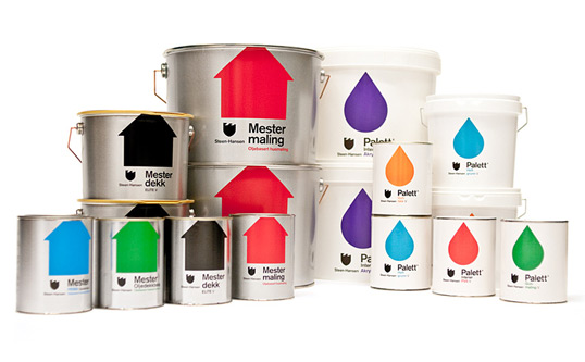
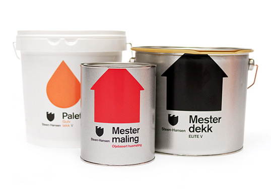
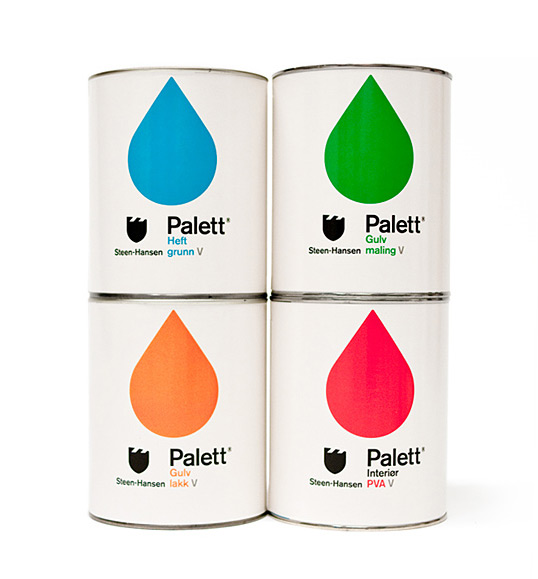
Steen-Hansen
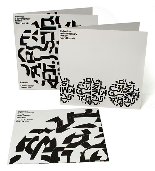
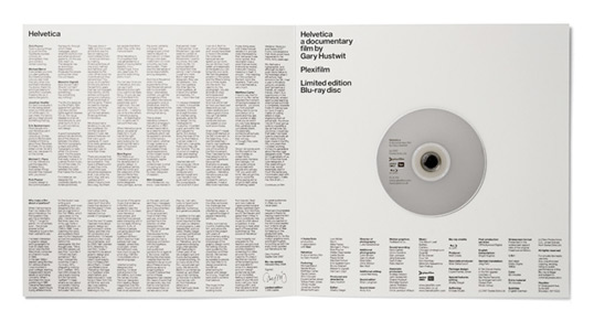
Helvetica Blu-ray
Designed by Experimental Jetset for the limited edition of Helvetica in blue-ray. This was a limited edition print of only 1500 copies, it came in a custom-made black cloth record bag, printed on one side with the disc motive. The sleeve includes a spiralling disc image with is made up from the Helvetica alphabet as shown on the 'Meet the Cast' poster, the idea behind it was to refer to 12" vinyl record and how it spins and the idea that Helvetica as a typeface is spiralling out of control.
New Work: Kanuhura Resort
Kanuhura Brochure and promotional booklet.
A bespoke alphabet was created from palm leaves.
Driftwood signage.
Victorian College of the Arts
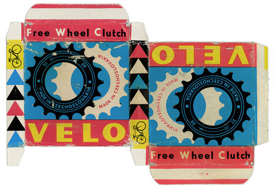
Vintage Packaging: Velo
This is a great little piece of packaging. Looks to me like a CMYK print onto the outside of the card. Bearing in mind the contents of the packaging the weighting has to able to contain the product. If this packaging was produced in the present day it would be done so by using either lithoor screen printing. I'm steering towards screen slightly as the colours are bold which can be achieved through screen.
Monday, 11 October 2010
Thursday, 7 October 2010
State the Obvious
Mash creative produced a collection of products, a range of merchandise and clothing which uses the products description to create a unique brand identity. Im unsure whether I like it or not, Im still undecided as of yet. The products in the range include: a bag, mug, t-shirt, notebook and a poster.
The bag has been printed on only one side with the handle double- stitched onto it. The bag only consists of a white screen print (Is what it says on there website, but Viable either flexo or pad printing) onto the 100% cotton bag. The mug has been printed onto a glazed black ceramic mug using screen print, it includes a printed protective box that has to be weighty enough to contain and protect the contents. Similar to the bag the t-shirt has been printed onto an 100% cotton tee with white only. The notebook has either a silver or clear foil debossed cover with cartridge paper inside. It is Hardback sewn and case bound, A5 size.
The the black and white lines on the boxes are pretty sweet.
Wednesday, 6 October 2010
Colour in Illustrator


Creating swatches in Illustrator is similar to both InDesign and Photoshop. It is done in the colour menu by selecting create new swatch, from this tints can also be produced for any of the swatches that are created. As well as CMYk colours, spot colours can also be created using the same method but selecting spot colour rather than process colour, again tints can be made from these colours too. Special finishes such as spot varnishes, foils and embosses would use a spot colour on file but you would specify with the printer what process you were using.

It is also useful to save the swatches that you create during a session so that you can apply them to other adobe programs or for later use. Another useful feature is the pantone book, this is helpful as it allows you to match up your created swatches to the universal pantone codes use by commercial printers.
Wednesday, 29 September 2010
Print Analysis Session
In this workshop we had to try and gain an understanding of the various print processes for our pieces of print that we were asked to bring in. We looked at the process, colours, stock, format, finishing, specials, target, cost band, quantity and competition.
The first item that we looked at was a Ikea furniture manual, which was produced using lithography quite possibly web due to the volume of prints that would be distributed. The manual only includes the spot colour black at a low percentage, printed onto newsprint which is folded twice so that it is the size of an A4 page. Between our group we came to the conclusion that the product is aimed at Ikea customers primarily young adults who are looking to buy inexpensive quality furnishings.
The second item is a free CD-ROM from the monthly design magazine Creative Review. The print onto the CD case was done using Flexography in the single black spot colour onto clear transparent film.The clear transparent film acts as a security seal situated at the opposite side to the hinges of the CD case. The CD is a freebie from the magazine, presuming the person brought the magazine, the CD would be aimed towards the readers of Creative Review.
Item number 3 is an American Apparel plastic bag produced using Flexography due to the scale, if there was limited distribution then a process such as silkscreen printing could be more viable. Again the bag only contains a single spot colour of white, printed onto a plastic which has been sonic welded together and die cut for the handles of the bag. The bag has to be budget as American Apparel is a worldwide company and the bags will be distributed too there various stores. Similar to the CD, the American Apparel plastic bag is used when a customer purchases and item from there store. The likely audience is people that are customers in stores and other shoppers that might be attracted to the design of the plastic bags.
Item 4 is Action Time Vision newsprint, which was purchased from the Design Museum in London containing information and visuals on the 70's punk music era. The print is produced using lithography, using CMYK printed onto newsprint when folded out it is the size of one broadsheet page. Apart from being sold in the Design Museum, the prints are possibly quite limited.
Item 5 is a Limited edition Esquire magazine, unlike the conventional magazines they publish this edition includes a canvas on board cover with both Matt and gloss inside. On the cover there is foil block type with the image as a rich black. (Cyan or Magenta underneath to give the black a richer colour. The magazine is perfect bound with two folds on the cover to create a spine. We decided that the magazine aimed at mainly men interested in style and culture.


Monday, 27 September 2010
Nottingham Trent University World
Nottingham Trent University recently commissioned Seismik to create an iconic cover and keepsake centerfold timeline highlighting design innovation from Nottingham.
The lace piece on the cover contains various elements from Nottingham’s creative heritage such as Pugin’s St Barnabus Cathedral and the Raleigh Chopper (among others). The centre spread focuses on the negative space from within the lace designs and acts as a timeline highlighting design innovation from Nottingham. This publication has been distributed worldwide.
Subscribe to:
Posts (Atom)